 In 2011, Jeff Gordon's famous long-time sponsor DuPont is stepping back a bit from full-time sponsorship. So next season the AARP is stepping up to sponsor Jeff in the majority of races. That means more times than not you won't see Jeff sporting the flames of DuPont that have been a fixture on the track since 2001. Instead you will see a gradient-heavy black and red AARP Chevy that is reminiscent of the infamous "T-Rex" car from 1997. As Jeff's career starts to wind down it would be great to see him go after that elusive 5th championship.
Thursday, December 9, 2010
Gordon's New Look
In 2011, Jeff Gordon's famous long-time sponsor DuPont is stepping back a bit from full-time sponsorship. So next season the AARP is stepping up to sponsor Jeff in the majority of races. That means more times than not you won't see Jeff sporting the flames of DuPont that have been a fixture on the track since 2001. Instead you will see a gradient-heavy black and red AARP Chevy that is reminiscent of the infamous "T-Rex" car from 1997. As Jeff's career starts to wind down it would be great to see him go after that elusive 5th championship.

Kurt Busch #22 2011
 Kurt Busch is switching from the famous Penske #2 Blue Deuce over to the #22 sponsored by Shell/Pennzoil. Kevin Harvick has been sporting the yellow and red for the last 4 seasons with a really nice scheme that fit the sponsor well with many curved and aggressive lines. This, however, is not good. It looks like somebody experimenting with the pen tool for the first time and this was the result. Oh well, at least the new Dodge nose looks great.
New Tribe Unis
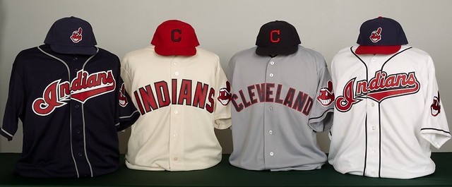
So the Cleveland Indians unveiled a new uniform set for the 2011 season. Overall they're half awesome and half meh. Both the standard home and alternate away jersey fall into the meh category. Except for some minor tweaks the home white has remained virtually unchanged since the 1994 overhaul and I think is due for a change. While not bad it has just grown a bit old. Plus, what's up with the cap's navy blue not matching the navy on the helmet, or any of the blue found on the Tribe's uni's for that matter. Looks even more noticeable on the road alt, which by the way goes back to the standard Chief Wahoo cap apposed to the script 'I'. Where these uni's shine are the new road grays. The Indians are going with a retro look that compliment the home alternate cream jerseys perfectly (more on those in a minute). The road grey's and home alts really clash with the script 'Indians' jerseys with the retro vs. modern look, script vs. block lettering, piping vs. no piping, Chief Wahoo vs. block 'C'. It's actually starting to become a mess really. That said, the cream home alts should really become the standard homes, and this team will instantly become one of the better looking team in baseball. A classic team really should stick with a classic look. But the worst move of all? Switching from the navy block 'C' cap on the home alts to red. Blah!
Tuesday, May 11, 2010
F & C

Coming from a racing buff I find this logo to be clever. The FIA is the sanctioning body to Formula 1 and this is their old school logo that still pops up from time to time. It simply contains the letters FIA but has a cut-out of a Formula 1 car inside. The wheels of the car make up the crossbar of the A and F.
F & C

The goal of the classic Milwaukee Brewers logo was to create an image that shows baseball, while incorporating the city and team at the same time. By arranging the first letters of both the city and team name, and baseball glove is formed, which is a key element to the game and a very recognizable trait. Filling the ‘eye’ of the lowercase b with a simplified image of a baseball really makes this mark visually interesting. Not only does it aid in the overall design that shows this in indeed a baseball logo, it also adds to the imagery of the logo by showing a baseball in int’s proper location in the pocket of the glove.
F & C

This is the logo used during advertising campaign for the movie Objectified. It can be found on the movie poster in the midst of a series of silhouetted objects found in everyday life. Obviously, the world spells out Objectified, the title of the movie, and it’s comprised of objects that you can find anywhere that resemble letter forms.
F & C

I think this is a very effective logo that contains more than initially meets the eye. When the viewer firsts observes this mark, it easily reads the word “Thirteen”, as it should, but upon further inspection one starts to realize that there are missing characters. While at first that may seem like the case, but in truth it is not, and this is where the connections between content and form come in. Herb Lubalin’s goal here was to visually recreate the word “Thirteen” while still making it visually interesting, so what he did was shorten the overall length of the word by subtracting parts of letter forms and combining them with others. The result is the illusion of a shortened word that still contains all of its letters.
Subscribe to:
Posts (Atom)
